

Best Practices in Prototyping
Getting Started by Visualizing Data
It is always tempting to dive straight into prototyping and algorithm development activities. But taking some time at the outset to better understand data always leads to more nuanced insights and relevant results because teams are able to identify issues and nuances early on.
The best way to know if data contain useful and relevant information for solving a problem using machine learning is to visualize and study the data. If possible, it is better to work with SMEs who are familiar with the problem statement and the business nature while visualizing and understanding the relevant data sets.
In a customer attrition problem, for example, a business SME may be intimately familiar with aggregate data distributions such as higher attrition caused by pricing changes and lower attrition for customers who use a particularly sticky product. Such insights, observed in the data, will increase confidence in the overall data set or, more importantly, will help data scientists focus on data issues to address early in the project.
We typically recommend various visualizations of data in order to best understand issues and develop an intuition about the data set. Visualizations may include aggregate distributions, charting of data trends over time, graphic subsets of the data, and visualizing summary statistics, including gaps, missing data, and mean/median values.
For problem statements that support supervised modeling approaches, it is beneficial to view data with clear labels for the multiple classes defined, for example customers who have left versus existing customers.
For example, when examining data distributions across multiple classes, it is helpful to confirm that the classes display differences. If data differences, however minor, are not apparent during inspection and manual analysis, it is unlikely that AI/ML systems will be successful at discovering them effectively. The following figure shows an example of plotting data distributions across positive (in blue) and negative (in orange) classes across different features in order to ascertain whether there are differences across the two classes.
In customer attrition problems, those customers who have left may represent a disproportionate number of inbound requests to call centers. Such an insight during data visualization may lead data scientists to explore customer engagement features more deeply in their experiments.
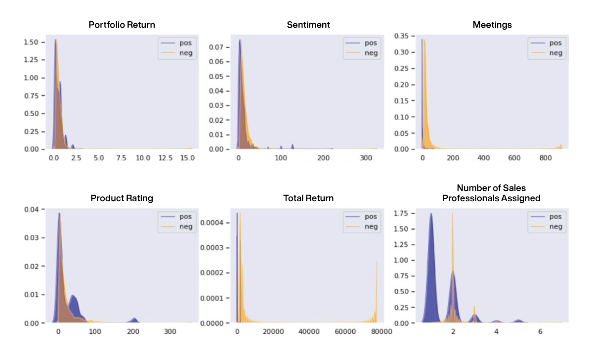
Figure 29: Understanding the impact of individual features on outcomes or class distributions can offer significant insight into the learning problem
We also recommend that teams physically print out data sets on paper to visualize and mark up observations and hypotheses. It is often incredibly challenging to understand and absorb data trends on screens. Physical copies are more amenable to deep analysis and collaboration, especially if they are prominently displayed for team members to interact with them, for instance on the walls of a team’s room. Using wall space and printed paper is more effective than even a very large projector. The following figure shows a picture of one of our conference room walls that is covered in data visualizations.

Figure 30: Conference room walls covered in data visualizations to facilitate understanding and collaboration during model development
In the following figure from an AI-based predictive maintenance example, aligning individual time series signals makes it possible to rapidly scan them for changes that occur before failures.
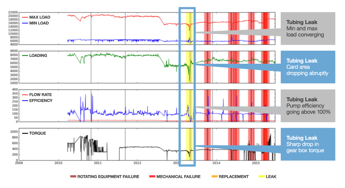
Figure 31: Example of a time series data visualization exercise as part of an AI-based predictive maintenance prototype.
By visualizing these data, scientists were able to identify small patterns that can later be learned by algorithms.