

Best Practices in Prototyping
Pressure-Test Model Results by Visualizing Them
Data scientists will often focus, rightly, on aggregate model performance metrics like ROC curves and F1 scores, as discussed in the article “Evaluating Model Performance” in this guide. However, model performance metrics only tell part of the story; in fact, they can obfuscate problematic model issues like information leakage and bias, as discussed above. Managers should recognize that complex AI problems require nuanced approaches to model evaluation.
Imagine that you are a customer relationship manager and your team has given you a model that predicts customer attrition with very high precision and recall. You may be excited to use the results from this model to call on at-risk clients. When you see the daily model outputs, however, they don’t seem to change much; in fact, you receive calls from your customers that they are abandoning your business. In each case, you check the AI predictions and see that the attrition risk values are extremely high on the day the customers call you, but extremely low on the preceding days. The data scientists have indeed given you a model that has very high precision and recall but it has zero actionability. In this case, you need sufficient advance warning in order to save those customers. While this is an extreme example – and usually the formulation of the AI/ML problem would seek to perform the prediction with sufficient advanced notice – the visualization of risk scores is still extremely valuable.
Visually Inspect Model Results
To combat this potential problem before deploying models into production, we recommend a visual inspection of example interim model results similar to the visual inspections performed on the data inputs discussed above.
A commonly used technique that we recommend involves producing model outputs that mimic or simulate how actions and business processes are likely to occur once the model is deployed in production.
For example, if a team is attempting to predict customer attrition, it is imperative to visually inspect attrition risk scores over time; if the model is indeed useful, it will show a rising risk score with sufficient advance warning to enable the business to act. For models like this, practitioners can also make sure that risk scores are indeed changing over time – in other words, customers are potentially low risk for a long period of time and then risk scores rise as they grow increasingly dissatisfied about such things such as interactions with their financial advisor, economic returns, costs incurred, or available products and services.
We recommend following a similar approach to what was used during the data visualization phase of the prototype work – building out different visualizations and individual case charts, socializing these among the team and experts, printing out physical copies, and placing them prominently to encourage interaction, collaboration, and problem solving.
In the example in the following figure, the predicted risk score is visualized in orange. A score of 1.0 corresponds to 100 percent likelihood of customer attrition. The blue vertical lines represent true examples of attrition.
By visually inspecting plots of model predictions over time, we can see how the models change and evaluate their effectiveness in real-life situations.
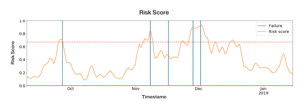
Figure 34: Example output of a trained machine learning model to predict customer attrition (orange) overlaid with true attrition labels (blue)